Welcome to the re-launch of the OCA’s web site
Posted On August 11, 2001
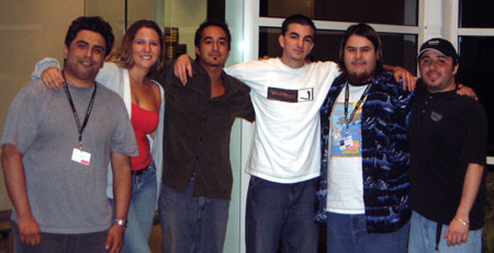
Since August I have been working with a group of students from The Art Institute of California - Orange County (based in Costa Mesa) on creating a new design for the OCA site. I was approached by a colleague from my prior job who was teaching a web media design class. The students course-work needed to be based upon the development of a new design for a web site. Ideally they wanted to work with a real live client rather than to make one up. We, the OCA, were the real-live client. In order to work on this project they appointed a project manager, content manager, information architect and various site developers and graphic designers.
I held a meeting with the students just prior to my vacation to the UK in August. At this meeting I presented to them our existing web site and spent some time describing our organization, it's mission and goals. I also descibed to them various improvements that I was looking for with a new site design. After this meeting the group set about taking the input I gave them, coupled with an in-depth look at the existing site - and started to create three different possible designs for the new web site.
After a few weeks the students came back to me with the new designs. I showed these ideas to other board members and club members. From the three "comps" they showed us we chose one as the winner. At this point the group started in earnest to re-develop the new site. This involved coming up with some standard template(s) for various sections of the site.
The students handed over to me their design about 3-weeks ago at a meeting held at their facility in Costa Mesa. They presented to me all of the files they had updated at that time and took me through all of their work. They had all done a very fine job!.
Ever since then I have been massaging the remaining old content into the new template design they came up with. I have also been creating a lot of new content. I think it works pretty well and creates some new functionality that I have been looking to implement for some time.
Here is a summary of some of the major changes to the site.
New OCA Header
One of the first things you'll notice is that I have replaced the OCA header with a one-line header with the OCA Galaxy swirl and behind that a "cool" rotating galaxy image. This is my only relapse into a "cool" type of effect for the web site. I don't think it detracts too much from what is going on. You will need to have Flash installed on your system - if you don't you will be asked to install it automatically. Flash is actually on more people's computers than any other browser plug-in - so I suspect that most of you will not even notice anything funny going on.
Global Navigation
Primarily the main change I asked for was related to global navigation. This is web-speak for a menu that appears on every single page of the web site. The current site has you getting lost every now and then because the navigation is really only on the home page. The new setup uses a special drop-down menu system that allows me to organize the web site by category and to have a lot of links represented on this menu. When you first access the new web site (if you have a dial-up modem) you may notice a short delay while the global navigation stuff is dowloaded for the first time. That will only happen once. From then on all the menus are cached on your system and accessing other web pages should be reasonably rapid.
This new navigation has been designed to make it easier for you all to get around the web site and find the content you are looking for. Every part of the menu has a page behind it and is clickable - so just click away - you might besurprised at what you find.
Ideas for new content changes to the web site.
I have been looking over the web logs on our web site. These logs show me what the most pupular parts of the web site are for visitors. I used what the web reports told me to help prioritize some of the changes to content and layout that I wanted to implement.
Calendar Events right on the home page.
The home page content has undergone some subtle but significant changes. With the moving of the navigation onto the top of the page we end up with more space on the page for other useful information.
It turns out that one of the most frequently accessed parts of the site is the calendar. In the new version of the site you will find some of the most significant events from the calendar are displayed right on the left side of the home page (saving you the extra click you would otherwise have to have done). The home page now shows the date of the next Black Star and Anza star parties and the next general meeting. Below this you will also find the events from the calendar over the next two weeks.
Anza Weather Dashboard
I have created a special Weather Dashboard which combines the information from three different pages onto one single page in this new version of the web site. Now one click gets you what it would have taken 3 or more previously.
More extensive section About the OCA
We get on average 400 visitors a day to the web site. Most are members - but a significant number are people interested in finding out what our club is all about. Our old site has a lot of information relevant to potential new members of the oca - but it was quite hard to find. I have made the existing information easier to locate and added a great deal more information to the section. Some of this information comes from a color brochure we recently created and now distribute at outreaches and other events.
Compatible Browsers.
If you still use IE version 4 or below - or Netscape version 3 or below - you may find this web site does not display exactly as intended (this represents less than 4% of our visitors). It has been designed to operate in IE 5 and above and Netscape 4.7 and above. However the Calendar section remains to be a little problematic for Netscape users in general (sorry about that- I'll work on a fix)
Feedback
In this re-launch of the web site the students and I have had to work on over 1000 web pages. It will be a miracle if everything works completely without error. Please do send me links to any pages where there is a broken link or other problem that needs my attention.
Need more content!
Additionally - a special message to OCA members - this is your web site. I always welcome receiving and publishing information sent to me by members. If you are attending any astronomically relevent event outside the club I want to hear about it and publish it on our web site.
How much did this new web site cost?
You probably think that is a pretty silly question! You are right - in that it didn't cost the club a single penny. However, the students were doing this as a real-live example of a customer project and they did treat us like a real client. At the close of the project I was informed they had budgeted around $36,000 worth of work on the proejct (and they just went over their plan by a small amount). So this new site design, including my own time spent on the project, amounts to some $60,000 worth of commercial time spent on it. Makes you think!


